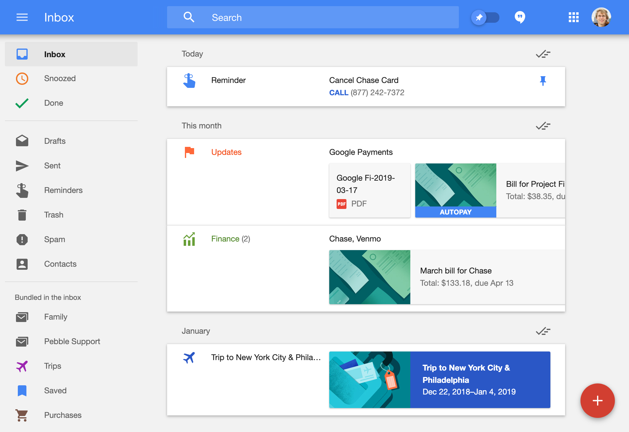
Yesterday, Google announced that their Inbox product would be killed on April 2, 2019. Never heard of Inbox? Not surprising. It always occupied sort of a weird position in Google’s pantheon of products, perhaps being best described as an alternative UI for Gmail. Despite its awkward positioning, I believe that Inbox was, and probably will be for the foreseeable future, the greatest email client ever designed.
Background
Inbox, at its core, represented Google’s attempt at building a “task-based” email system. The concept of Task-based email was popularized in 2012 by a Kickstarter project: Mail Pilot. The project page explains the concept as follows:
All new messages arrive as incomplete and remain that way even after you’ve read them. Mark a message as complete only after you finish any further action associated with that email.
With Inbox, Google released an alternative interface for Gmail that did away with most legacy e-mail holdovers, replacing them with an elegant complete/incomplete system. Similar to a function in Mail Pilot, Google also added the ability to “snooze” emails, hiding them from your Inbox until a later date, giving you more ability to reduce clutter. However, if that was all Google achieved with Inbox, there would be plenty of viable replacements, including even the venerable Mail Pilot, which is currently at version 3. Inbox, however, could do so much more, and much of this functionality remains nonexistent in any competing software.
Part 1: Bringing Order to Your Emails, via Machine Learning
Way back in 2013, Gmail gained the ability to automatically sort emails into four different categories: Social, Promotions, Updates, and Forums. Social contained email from social networks, Promotions is fairly self explanatory, Updates would include things like receipts and bills, and Forums would receive emails from mailing lists. Using Google’s vast email dataset and machine learning expertise, Gmail was able to automatically sort emails into these four buckets, with all other emails going into a “Primary” category based on their presumed importance.
In the six years since this feature was released, it remained exactly as it was released. At least in Gmail. In Inbox, however, it was fleshed out into a far more exciting version of itself. Inbox’s variant contains not only Gmail’s four groupings, it also adds three new ones: Finance, Purchases, and Trips.
Finance & Purchase Bundles
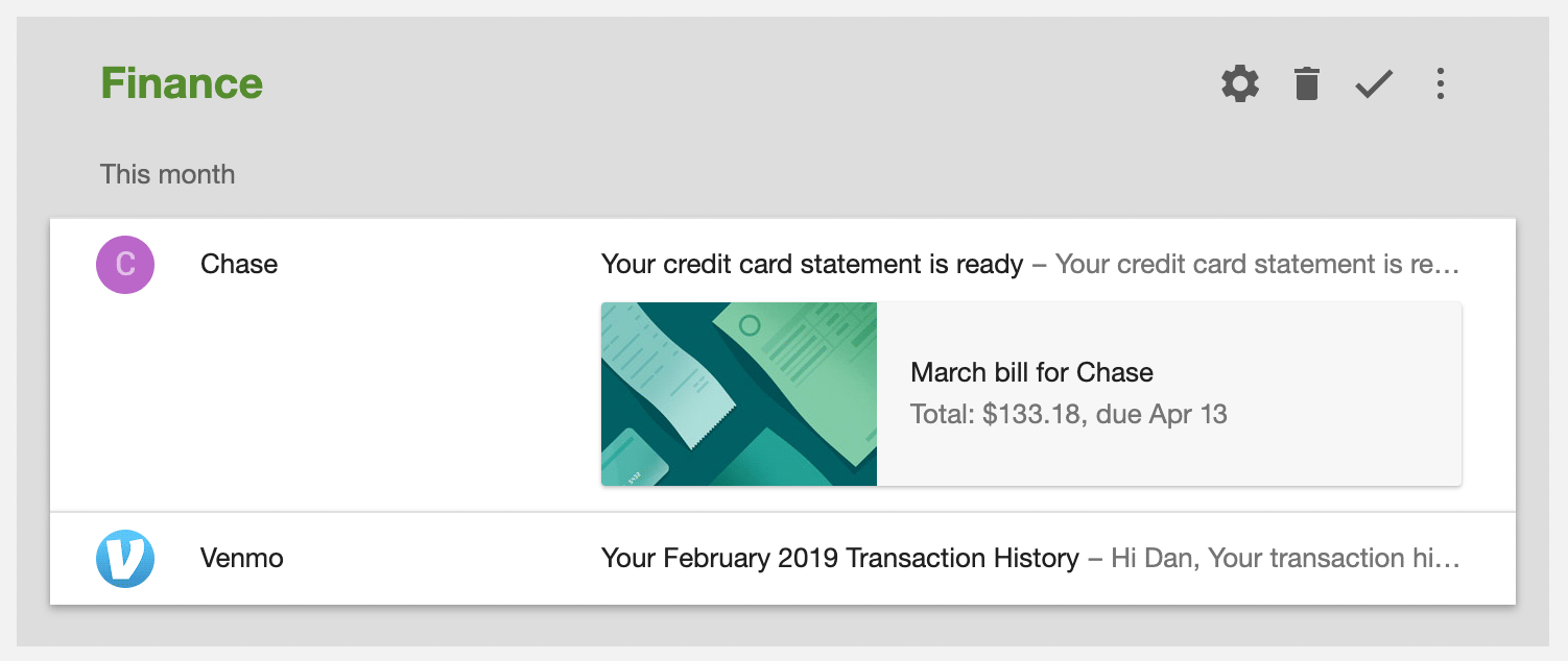
The often overused “Updates” category remained, but slices of its content were spun off into two additional subcategories: “Finance”, and “Purchases”. In addition, both of these categories, gained additional automatic e-mail parsing abilities; Inbox can extract the due date and amount from a credit card bill, or the tracking number from an Amazon order. Certainly a minor convenience, but a convenience nonetheless.
Trip Bundles
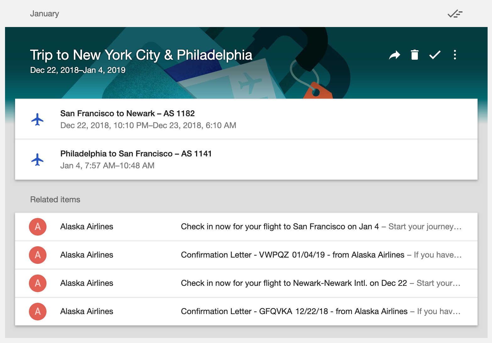
While the ability to extract Amazon tracking numbers was certainly convenient, it paled in comparison to my favorite Inbox feature of all, and one that as of yet no one has even tried to replicate1: the Trip bundles.
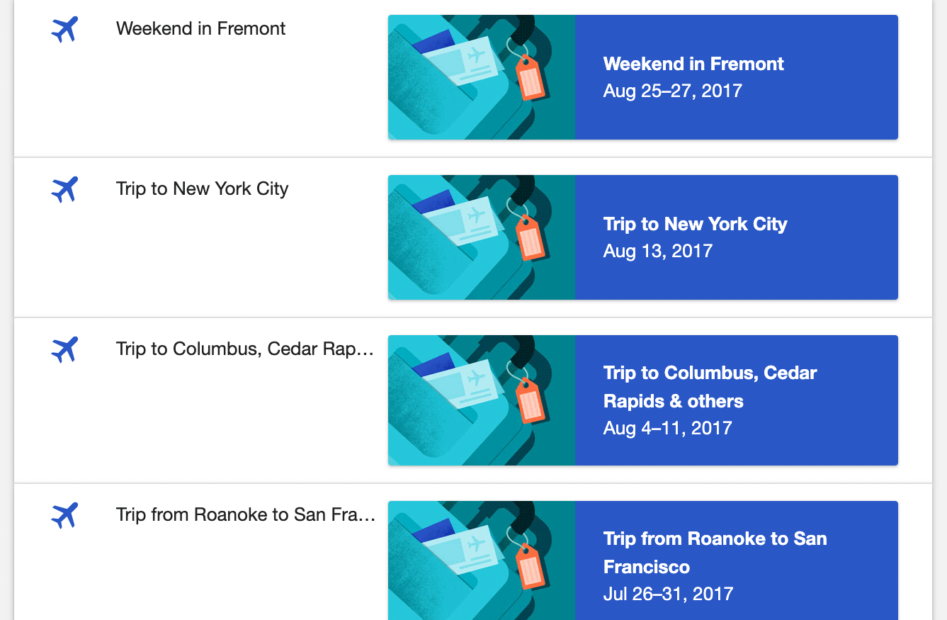
Trip bundles can automatically extract flight and hotel information, and determine which flights and hotels are associated with which trips. It then groups each individual trip together as a single entity. Not only is this useful for an upcoming trip, but it is fabulous for archival, since the grouping is retroactively applied to every trip-related email I have in my account:
Part 3: A Polished Experience
To me, Gmail feels like a strange mashup of several dozen different developers’ opinions about how email should work. If offers a variety of bizarre options-that-shouldnt-even-be-options like “should the button labels be text or icons” (spoiler alert: the answer is both2).
Email list view and detail view flow seamlessly together
Gmail requires a context switch every time you click an email. You’re in the list, now you’re in the email! Go back and…where were you in that list again? Many e-mail clients attempt to mitigate this by using multiple panes. Even Gmail itself can do this, if you enable the “two-pane” option in the settings! Problem solved, right?
Except that I would argue that Inbox’s approach is still superior. By clever use of animation, it remains consistently clear where you are in the flow at all times:
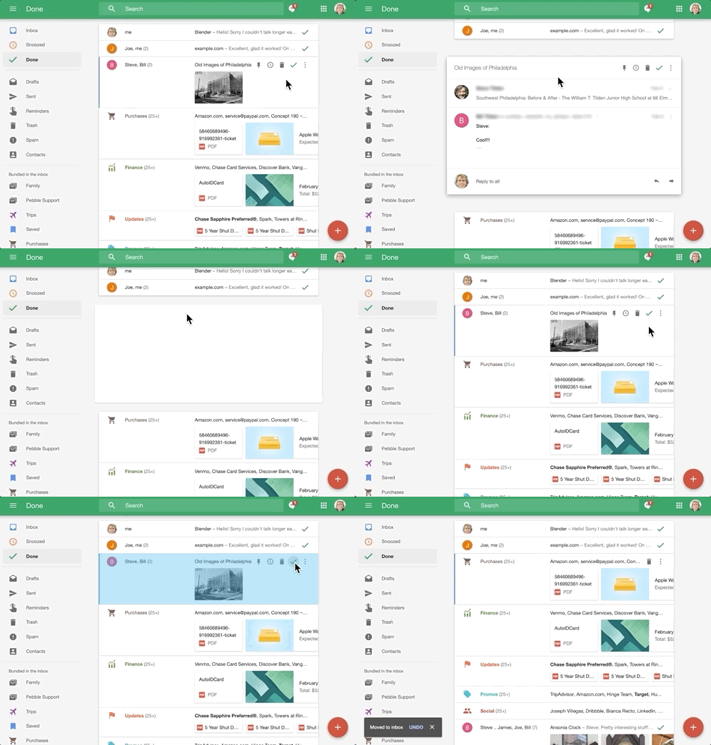
They even apply this logic to folders, using the “bundles”, the grouping system mentioned above. Just as when email are opened, bundles expand out seamlessly into the flow of emails! I find this a far better approach than Gmail’s category tabs.
Built-in reminders handle the “email to yourself” scenario

Another holdover behavior from past email clients (that I still used to do!) was write emails to myself to remind you of things, or to save links, etc. Inbox includes built-in support for this, with its integrated “reminder” support.
Unread actually means unread

Conceptually, one cannot un-read a message; the very idea is inherently absurd. Yet most email clients offer this option as if it’s a completely normal thing to do. I believe this is an awkward holdover from legacy mail clients that could only store 1-bit of metadata for each email. It is, in my view, thoroughly obsoleted if an email client has properly designed categorization abilities. In short: it’s better to create a new organizational construct (that of “completeness”), than to arbitrarily assign meaning onto something effectively unrelated.
Part 3: Alternatives
I’ve explored several alternatives. Spark has been actively promoting itself as an Inbox alternative, and there’s also the classic, MailPilot, which is currently beta testing version 3. As much as I want to like…any…of them, they appear to be fairly vanilla task-based email implementations, with none of the niceties that made Inbox special.
To Conclude: What would Gmail need to properly replace Inbox?
When Google announced that they intended to kill Inbox six months ago, their support page implied that, before Inbox’s death, its core features would be brought to Gmail. As of this writing, they have ported snooze, the amusing yet useless smart-reply function, and perhaps the most exciting feature of all, quick action icons that appear when hovering the mouse cursor over an email:

That’s it. That’s everything Google has ported.
Could Google have ported more? Of course. Key Inbox features, like automatic travel grouping, or even the Finance category, are nowhere to be seen in Gmail. Even more-complex UI features like bundles could conceivably have made it in: Gmail already offers 5 different Inbox styles to cater to different types of users, and could have easily included sixth with a more Inbox-like view. But no. We get snooze and quick actions. According to the cheerfully-written Inbox closure notice, these apparently represent the entire sum of “my favorite Inbox features”:
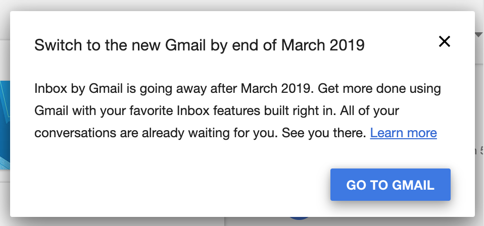
Ultimately, I understand that it doesn’t make sense for Google to operate two separate applications that basically do the same thing; given this, it’s completely reasonable for them to kill the less-popular one. What I find particularly unreasonable is Google’s decision to kill the less-popular one without seemingly even trying to bring over the majority of its key features, some of which continue to remain far ahead of any competitor’s offering.
Is there actually a viable alternative that I missed? Do you work for Google and wish to repent for your sins? If so, why not discuss this article on Hacker News!